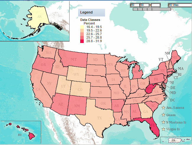
Equal-Interval map displaying percentages of household in each state with at least one individual over age sixty-five
Stereotype Exploration
I researched the stereotype that most elderly people (defined in this project as people over the age of sixty-five) live in Florida and Hawaii. The reasoning behind this generally seems to be that elderly people are retired, and that Florida and Hawaii are desirable places to retire to because of the warm climate and the scenic, relaxed, quiet lifestyle the areas afford. To create a map to compare this hypothesis to reality, I used the website AmericanFactFinder, which displays results of the most recent U.S. census and computes the data into maps. I selected my parameters for the map as all states within the United States. I then selected the data I wanted to see (selected social characteristics) and, within that data, the percentage of households with one or more people over sixty-five. I then created a map that displayed this data in equal intervals, to get a good sense of which states had higher percentages of elderly citizens.
After creating the map, I found that my hypothesis/stereotype was supported. There were five different categories into which the states were classified. The states in the highest category were those that had 28.8% to 31.9% of households containing at least one person over sixty-five years of age. There were only three states that contained such a percentage. They were Hawaii, Florida, and West Virginia. Though the stereotype in question did not mention West Virginia, the ideas about Hawaii and Florida were confirmed. Thus, they compromised two of the three states with the highest percentage of households containing at least one person over the age of sixty-five (which is generally how the term “elderly” is defined).
Despite the fact that the census data, when compared and laid out on a map, actually supported my hypothesis, the data is subjective. For example, I am looking at the data laid out in an equal-interval format. However, should the data layout change, so too would the results. When viewed using quantile breaks, the data looks much different. The highest category is states with 26.6% to 31.9% of households having at least one person over the age of sixty-five. On this map, the states in this top bracket are not only Florida, Hawaii, and West Virginia, but also Pennsylvania, New Jersey, Delaware, Maine, and Arizona. When only West Virginia rivaled the states that, according to my hypothesis, would have the greatest amount of elderly citizens, the stereotype still remained supported because the majority of the highest bracket states (two-thirds) were the stereotypical ones. However, with the quantile map, the stereotyped states would account for less than half of all the states in the highest bracket. Thus, when viewing such data on a quantile map, my hypothesis/stereotype would be weakly, if at all, supported. Thus, by choosing to display the census data on an equal interval map, the data is being manipulated (somewhat) to support a certain theory. The different representations of data on chloropleth maps were exactly a fear of Mark Mormonier’s as expressed in his book Lying with Maps, and in exploring and mapping data from the latest U.S. census to explore a stereotype, his fears have been realized in a single student’s project.
Map scale has a pretty large influence on how viewers perceive a map (specifically, in this case, my map). Since the map is shown at the scale of the whole country, viewers see data that is averaged for the entire state. This means that some states look like they have much higher percentages of elderly citizens than others. While, on average, this fact remains true, different cities and towns within states might have different percentages of elderly citizens than the state average. Thus, while viewers can see which states have larger percentages of people over the age of sixty-five, they cannot see specific data for towns and cities within states. This sort of data would be helpful in viewing areas where more elderly citizens retire. Likewise, Montana probably does not have as large of a general population as Florida does. Thus, no matter how many elderly citizens an individual town might have, the overall state percentage is likely to be lower than that of Florida. So the data, while somewhat helpful when shown on a scale of the entire country, is not necessarily representative of the reality of where elderly people live. To compare individual cities and towns, one might zoom in on the map to get a better sense of regions where elderly people live. Indeed, regions would probably give the best sense, because they can be spread across several states. However, the higher percentage of people within a certain region might live in a certain state, which would make it appear as though that state had a larger percentage of elderly citizens (when, in fact, it was the region). Thus, zooming in on the map could yield more informative results.
The American FactFinder could be extremely helpful to both public agencies and private companies. Public agencies could use the information to locate specific states (or even areas within states) to concentrate different services. For example, in the case of percentages of elderly citizens living in different states, a public agency could use the information to determine where it would be best to offer, say, flu shots at a local pharmacy. In the case of private companies, the information could be used to figure out where certain consumer groups are located and to target specific merchandise to the area. Again, using the hypothesis/stereotype I explored on my map, a private agency that sells dentures learn from the map that it would be more beneficial to work in Florida than in, say, Wyoming. Likewise, a factory would see that since there are more retired people living in Florida than most other places in the country, they would have more trouble finding workers there. Thus, public agencies could use the information to better serve people and private companies could use the information to increase profit.
